Christmas Party Decorations
Lush Party Boutique · Christmas Party Decor Guide
Christmas Party Decorations
The Complete Styling Guide
Three decor directions, four zones of the room, the table decorations that tie it all together, and a modern alternative to red-and-green — plus stationery that carries the same aesthetic from the invitation to the centrepiece.
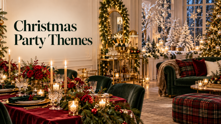
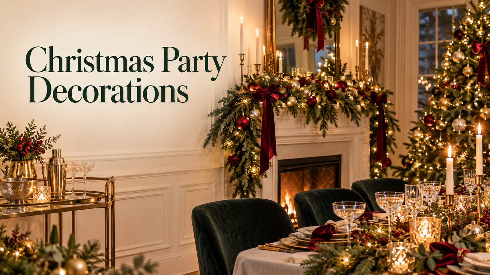
Great Christmas party decorations do one thing above everything else: they say ‘welcome’ before anyone rings the doorbell. The wreath on the door, the warm glow visible through the window, the table set as though it has been waiting for this exact gathering — these are the decorations that guests remember and that make the evening feel specifically designed rather than generically festive. The difference between a decorated room and a styled one is simply a matter of choosing a direction and building everything within it, rather than assembling whatever is available in December.
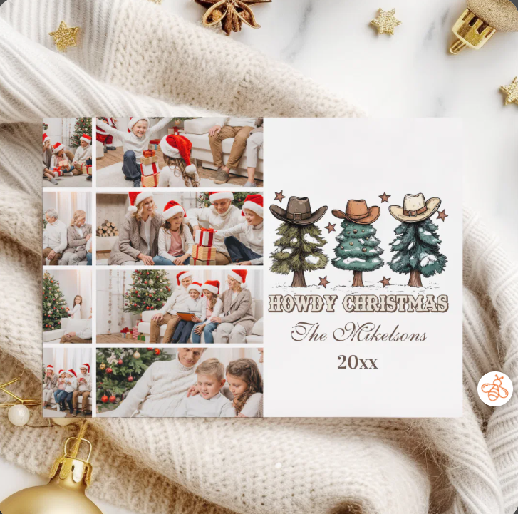
Browse all Christmas party decor collections at Lush Party Boutique — stationery, table details, and party decor across every direction from cozy rustic to cool modern blue.
🎄 Christmas Party Decor Collections — Lush Party Boutique
Woodland Christmas
Woodland Christmas Collection
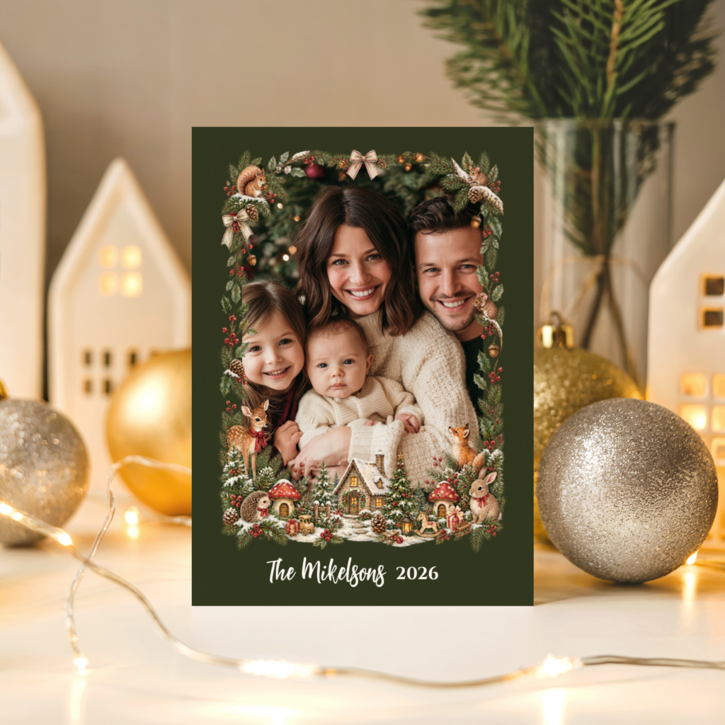
Earthy forest tones and natural botanical illustration — the cozy, rustic Christmas party decor direction.
Plaid Christmas
Plaid Christmas Collection
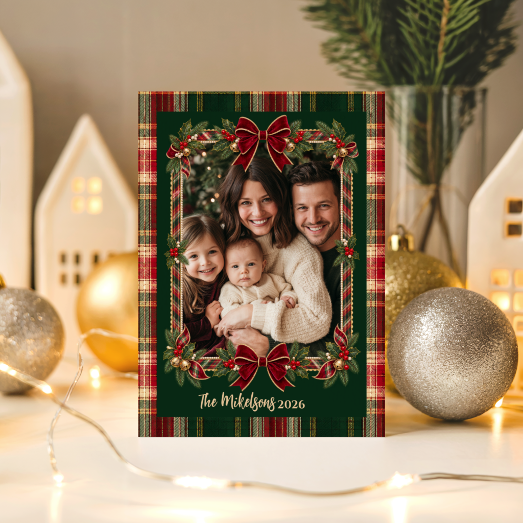
Classic tartan in deep red, forest green, and gold — warm, cozy Christmas party table decor with a timeless pattern.
Ornaments
Christmas Ornaments Collection
Traditional ornament motifs in red, gold, and evergreen — the classic ornamental Christmas party decor direction.
Blue Christmas
Blue Christmas Collection
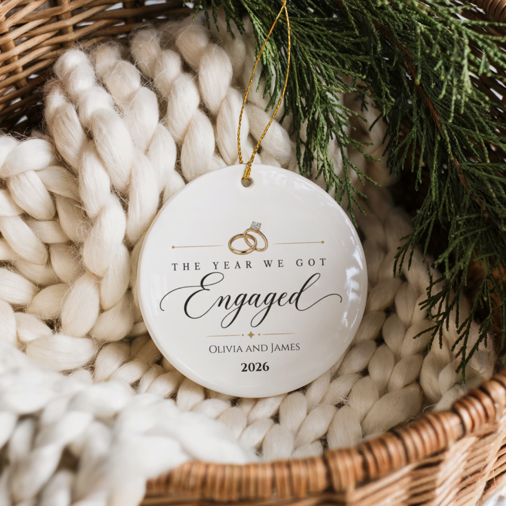
Cool silver-blue and midnight tones — the modern, non-traditional alternative to red-and-green Christmas party decor.
“The best Christmas party decorations say ‘welcome’ before anyone rings the bell — a wreath, a lit window, a table set as though it has been waiting all month for this exact gathering.”
Section 01Three Christmas Party Decor Directions — Choose One Before Buying Anything
The most common Christmas party decoration mistake is not spending too little or choosing the wrong items — it is mixing decoration directions that belong to different aesthetic worlds and then wondering why the result looks busy rather than styled. A warm rustic woodland table runner fighting a set of cool-blue ornaments fighting a traditional red-and-gold centrepiece does not read as eclectic. It reads as a room where three different parties are happening simultaneously. The solution is to choose one of three directions before buying a single item, then build everything within that palette family.
Direction 1 — Cozy and Rustic (Woodland & Plaid)
Warm wood tones, natural textures, and the specific cozy warmth of a December gathering where the aesthetic comes from the materials themselves rather than from decoration. Woodland and plaid patterns in deep forest green, warm red, cream, and natural tan. This direction belongs to gatherings that feel like a cabin Christmas — candles, natural greenery, plaid table linen, and the warm glow of firelight whether real or simulated. It is the most broadly appealing of the three directions and the one that photographs most warmly in the low, amber-toned light of a December evening.
Direction 2 — Classic Ornamental (Ornaments Collection)
Traditional red, gold, and evergreen as the visual language, with ornament motifs — baubles, stars, Christmas trees — as the primary decoration element. This is the Christmas party decor direction that reads as specifically, unambiguously festive: the palette every recipient associates with the season, delivered with enough quality and consistency across table and room that it reads as styled rather than generic. The key distinction between classic ornamental done well and done generically is material quality and palette restraint — one or two ornament colours used consistently throughout, rather than every ornament colour used simultaneously.
Direction 3 — Cool and Modern (Blue Christmas)
A non-traditional cool-toned palette — midnight blue, silver, pale ice, and the specific cool-white of a winter night sky — that reads as specifically modern and specifically different from every other decorated room guests will visit in December. This direction is for the host who wants their Christmas party decor to feel like a deliberate design statement rather than a seasonal default. It photographs beautifully in natural or cool-toned lighting and reads as sophisticated where the warm directions read as cozy.
✨ Styling Tip
Pick one of these three directions before buying a single decoration item. Mixing a warm rustic plaid runner with cool-blue ornaments and a traditional red-gold centrepiece fights itself visually — each element undermines the others. Choose the palette family first, then build every subsequent decision within it. Three items from one direction always looks more styled than ten items from three.
Woodland Christmas party decor from Lush Party Boutique — the cozy, rustic direction in forest tones and natural botanical illustration.
Section 02Christmas Party Decor by Zone — Entryway, Table, and Beyond
Once the palette direction is chosen, the next decision is which zones of the party space to decorate and in what order of priority. Not every surface needs attention; the three zones that make the most visible difference are the entryway, the table, and the room’s focal point (a fireplace, a mantle, or a well-placed sideboard).
The entryway. A wreath on the door and one visual detail at the entrance — a lantern, a small arrangement of seasonal greenery, a welcome sign in the party’s aesthetic direction — is all the entryway needs. It sets the aesthetic register before guests enter the main space and communicates that the decoration is considered rather than last-minute. The wreath should belong to the same palette direction as the table: a plaid-ribbon wreath for the cozy-rustic direction, a silver-and-blue wreath for the modern cool direction, a traditional evergreen wreath with red and gold accents for the classic ornamental direction.
The table. The table is where guests spend the most time and where the decoration decision is most visible and most photographed. A single centrepiece, a coordinated table runner or linen, and consistent place settings in the same palette direction create a table that reads as specifically designed. Adding too many competing elements — a centrepiece, individual table decorations at every place, a runner, and scattered individual ornaments — creates visual noise rather than styled warmth.
The room focal point. A mantle, a fireplace, or a sideboard decorated in the same palette direction as the table creates a visual through-line that makes the whole room read as intentional. The focal point decoration does not need to match the table precisely — it needs to belong to the same palette world. A woodland-direction table works with a mantle decorated in pine branches, warm candles, and natural textures, even if the specific pattern elements differ.
One further detail that ties the whole room together: stationery that carries the same aesthetic direction as the physical decor. A plaid Christmas invitation that guests received before the party creates a specific visual expectation — and when the room they arrive in belongs to the same plaid, warm-toned world as the invitation, the evening reads as designed all the way through.
✨ Styling Tip
Repeat only two colours from your centrepiece elsewhere in the room. If the table centrepiece uses deep red and warm gold, those two colours should appear in the mantle decoration, the napkin ties, and the wreath. Trying to match every surface to every element of the table creates a themed-store look rather than a styled home. Two repeated colours create cohesion; matching everything creates uniformity.
Plaid Christmas party decor and stationery from Lush Party Boutique — warm tartan in forest green, red, and gold that carries through from invitation to table setting.
Section 03Christmas Party Table Decorations — The Detail That Guests Sit With All Evening
The table decoration is the most examined element of any Christmas party because it is the one guests sit with for hours rather than passing in a hallway. Every detail at table height — the centrepiece, the place setting, the runner, the small ornamental details at each cover — has time to be noticed, appreciated, and photographed. Four specific decisions cover the full table decoration brief.
The centrepiece. One centrepiece per table, not several competing ones. A single well-chosen focal point — a cluster of ornaments in graduated sizes, a wreath laid flat on the table with candles at the centre, a low arrangement of seasonal greenery with three ornamental balls in the palette direction — reads as more styled than multiple smaller decorations scattered across the table surface. Height variation is the element that makes a centrepiece work: tall candles or branches alongside lower botanical elements.
The table runner or linen. A runner that belongs to the same palette direction as the centrepiece — a plaid runner for the cozy-rustic direction, a silver or midnight-blue runner for the modern cool direction, a rich red or gold runner for the classic ornamental direction. The runner defines the table’s colour baseline and makes every element placed on it read as part of the same considered world.
Place setting details. Small ornamental details at each place setting — a single ornament tied to the napkin with a ribbon in the palette colour, a small sprig of seasonal greenery tucked into the napkin fold, a place card in the same illustration style as the invitation — create the finished quality that separates a decorated table from a styled one. These details cost almost nothing individually and produce a disproportionate return in the quality of the overall table reading.
Coordinated place cards and menus. A Christmas party place card and menu in the same design direction as the invitation and the physical table decor is the detail that makes the table read as fully designed. It communicates that the stationery and the decor are speaking the same visual language — and that the host chose one direction and committed to it throughout the whole evening.
Christmas Ornaments party decor and table stationery from Lush Party Boutique — the classic ornamental direction in red, gold, and evergreen.
Section 04Blue Christmas — A Cool, Modern Alternative to Red-and-Green Party Decor
The conventional assumption is that Christmas party decor means red and green, possibly with gold. The Blue Christmas direction challenges that assumption entirely — and produces a party space that is immediately distinctive precisely because it is the one decorated room in December that does not use the expected palette. Midnight blue, cool silver, pale ice, and the specific clean white of a winter sky at night: these are the colours that make a room feel specifically festive without feeling specifically traditional.
The Blue Christmas party decor direction works best in rooms with natural or cool-toned lighting — where the pale, cool palette reads as atmospheric rather than chilly. Metallic silver elements — candle holders, ornament clusters, ribbon accents — add warmth within the cool palette without shifting it toward the conventional warm direction. And the contrast with every other decorated space the guest visits in December is itself part of the design effect: arriving at a blue-and-silver Christmas party after a week of red-and-green gatherings reads as a genuinely fresh and considered aesthetic decision.
The table in a Blue Christmas direction: a midnight-blue or silver table runner, clear glass candleholders with pale or silver candles, pale blue or silver ornament clusters as the centrepiece, and place cards in the same cool palette. The overall effect is specifically wintery rather than specifically Christmassy — which, for hosts who find the traditional palette limiting, is exactly the right register.
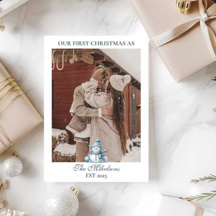
Blue Christmas party decor from Lush Party Boutique — the cool, modern alternative to red-and-green for hosts who want a genuinely distinctive December gathering.
Frequently Asked Questions
What is the difference between Christmas party decorations and Christmas party decor?
In everyday usage the two terms are interchangeable, but the distinction worth making in practice is between individual decoration items and a decor direction. Christmas party decorations are the physical objects — the wreath, the ornaments, the table runner, the place cards. Christmas party decor is the overall aesthetic system those objects belong to — the palette direction, the visual language, the decision about whether the evening reads as cozy-rustic, classic-ornamental, or cool-modern. Buying decorations without establishing the decor direction first is what produces the busy, themed-store result that most hosts are trying to avoid. Establishing the direction first is what makes the individual decorations work together.
How do I decorate a Christmas party without it looking like a themed store?
Three decisions prevent the themed-store reading. First: choose one palette direction and build everything within it — cozy-rustic, classic-ornamental, or cool-modern. Second: repeat only two colours from the centrepiece elsewhere in the room. Third: use restraint on the number of individual decoration elements. A room with one well-chosen centrepiece, a consistent table runner, and two repeated palette colours in the mantle or focal-point decoration reads as styled. The same room with five competing centrepiece elements, four different ornament colours, and decoration on every available surface reads as a retail display. Less, within one direction, always reads as more.
Can I do a non-red-and-green Christmas party and still have it feel festive?
Yes — and in many cases the non-traditional palette makes the space feel more specifically festive rather than less, precisely because it is unexpected. The Blue Christmas direction — midnight blue, cool silver, and pale ice — reads as specifically wintery and specifically considered in a way that the conventional red-and-green palette, seen in every decorated window and every shop display in December, cannot. The key is committing fully to the chosen palette rather than hedging toward the traditional — a mostly-blue room with a few red ornaments added for reassurance reads as confused. A fully blue-and-silver room reads as a deliberate design statement.
Lush Party Boutique · Christmas Party Decor
Shop Christmas Party Decor Collections
Five Christmas party decoration directions — cozy woodland, plaid, classic ornamental, and cool modern blue — all at Lush Party Boutique.