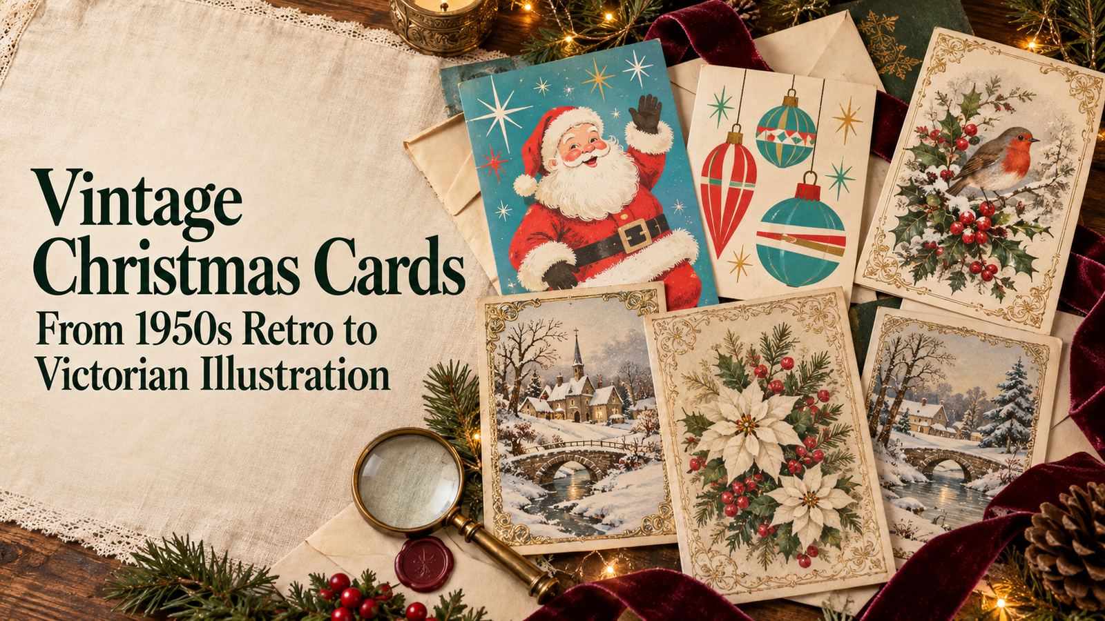
Vintage Christmas Cards
Lush Party Boutique · Vintage Christmas Card Guide
Vintage Christmas Cards
From 1950s Retro to Victorian Illustration
What makes a vintage christmas card read as genuinely era-specific rather than vaguely old-fashioned, the three styles to choose between, and the matching invitations and decor for a fully vintage-themed December.
The appeal of vintage christmas cards is not simply nostalgia. It is the specific warmth of an illustration style, a palette, and a typographic sensibility that belonged to a particular decade and communicated something about how Christmas felt in that moment — the optimistic flat-print graphics of the 1950s, the ornate engraved detail of a Victorian greeting, the soft nostalgic warmth of an illustrated winter scene that looks as though it has been in the family for decades. Getting a vintage christmas card right means committing to one of those specific eras rather than gesturing vaguely at ‘old.’
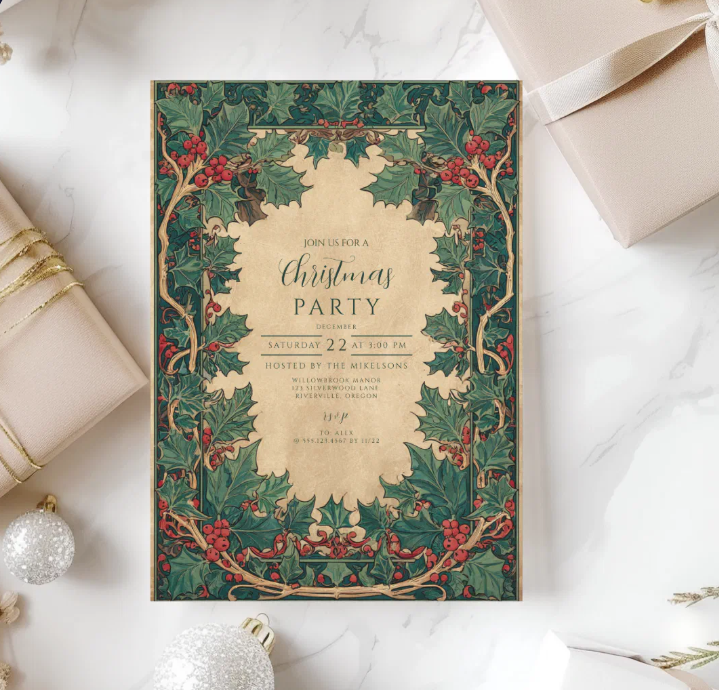
Browse the Vintage Christmas collection at Lush Party Boutique — heirloom illustration and nostalgic palette across cards, invitations, and party decor.
📜 Vintage Christmas Card Collections — Lush Party Boutique
Vintage Christmas
Vintage Christmas Collection
Heirloom illustration in deep cranberry, warm cream, and faded gold — the vintage christmas card that looks as though it has been in the family for decades.
Retro Christmas
Retro Christmas Collection
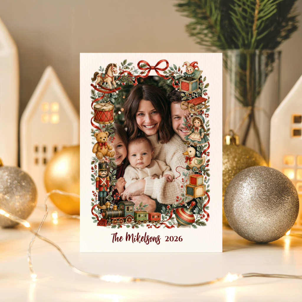
Bold flat-print graphics in the specific 1950s screen-printed style — the vintage christmas card for the mid-century collector.
Storybook Christmas
Storybook Christmas Collection
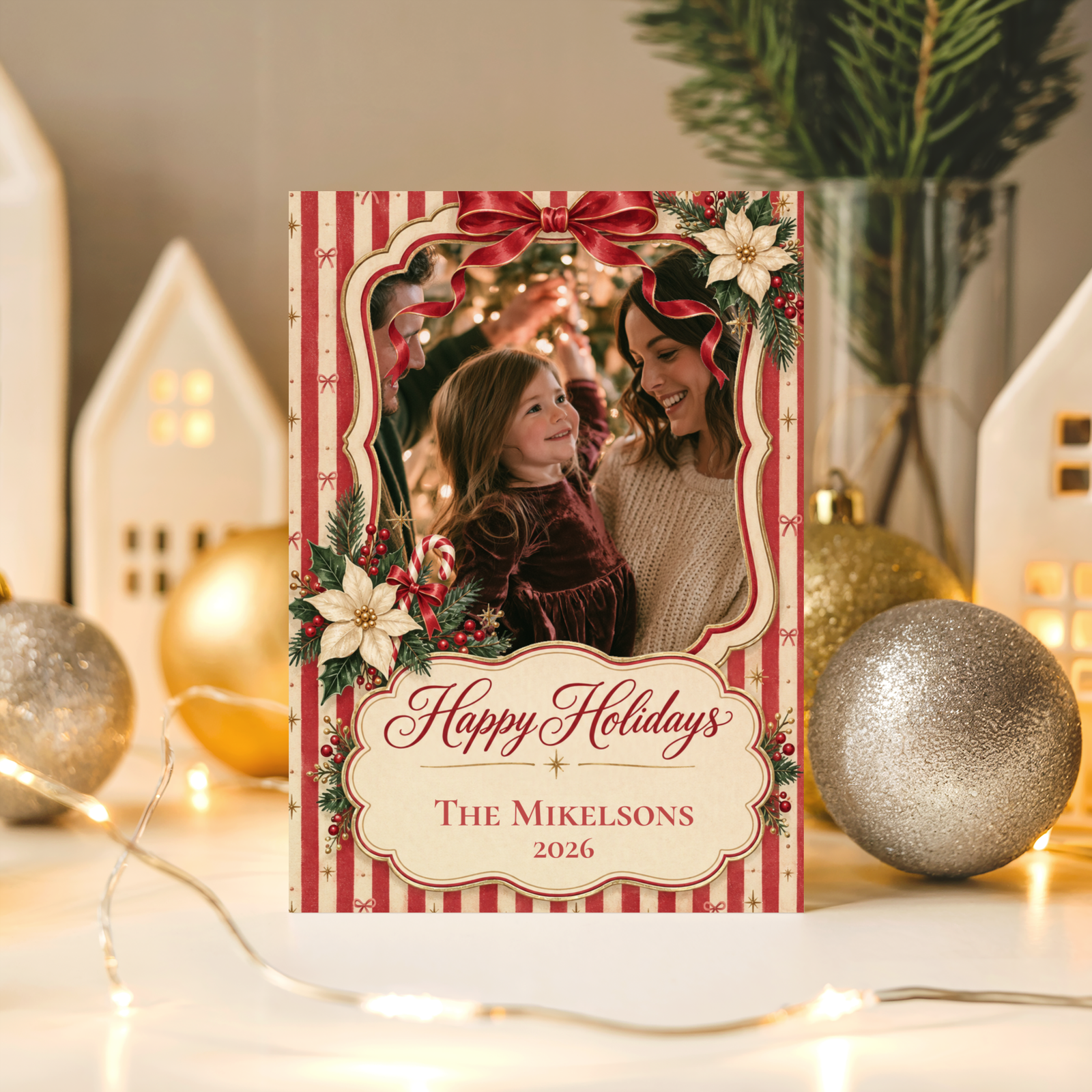
Soft nostalgic illustration in a warm winter palette — the vintage christmas card direction that feels inherited rather than designed.
Classic Christmas
Classic Christmas Collection
Traditional elegance in rich red and gold — the vintage christmas greeting card that holds across every decade.
“The best vintage christmas cards look as though they have been in the family for decades — not because they are old, but because every detail belongs specifically to its era.”
Section 01What Makes a Vintage Christmas Card Read as Genuinely Era-Specific
The difference between a vintage christmas card that reads as authentically period-specific and one that reads as ‘a modern card with a sepia filter’ comes down to three specific design decisions. Each one requires choosing an era and committing to its visual language rather than drawing loosely from several decades simultaneously.
Era-accurate illustration detail. A 1950s-style vintage christmas card has a flat, screen-printed graphic quality: bold outlines, limited colour fields, a slightly simplified illustration style that reflects the print technology of the decade. A Victorian-inspired vintage christmas card has the opposite character: ornate engraved detail, fine linework, elaborate border flourishes, and the specific warm depth of a period lithograph. These two styles are not interchangeable — mixing 1950s flat-print graphics with Victorian ornamental borders produces a card that reads as confused rather than vintage. Pick one era’s illustration style and hold it throughout the design.
A muted, aged colour palette. Modern printing produces colours that are brighter and more saturated than anything a genuine vintage christmas card would have achieved. Deep cranberry rather than bright red. Warm cream rather than white. Faded gold and antique brass rather than sharp metallic yellow-gold. Forest green with a slight warmth to it rather than the sharp, cool green of a modern festive palette. These specific muted, aged tones are what communicate ‘era-specific’ rather than ‘historically adjacent.’
Period-accurate typography and border details. The typography on a vintage christmas card is one of its most immediately era-placing elements. A 1950s vintage christmas card uses a specific script or bold sans-serif that belongs to that decade’s graphic design vocabulary. A Victorian-inspired card uses fine serif lettering with swash capitals and ornamental flourishes. Small details — scalloped card edges, period-accurate border ornaments, a typographic style that could only belong to one specific era — are what make a vintage christmas card read as designed rather than costumed.
✨ Styling Tip
Choose a specific decade or era — 1950s or Victorian — rather than a vague ‘vintage’ mood. A vintage christmas card that commits to one era’s visual details — the flat screen-printed quality of a 1950s design, or the ornate engraved illustration of a Victorian one — reads as specifically designed. One that vaguely gestures at ‘old’ without committing to a particular era reads as a modern card that has been given a sepia overlay.
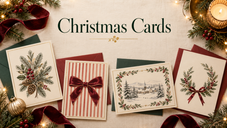
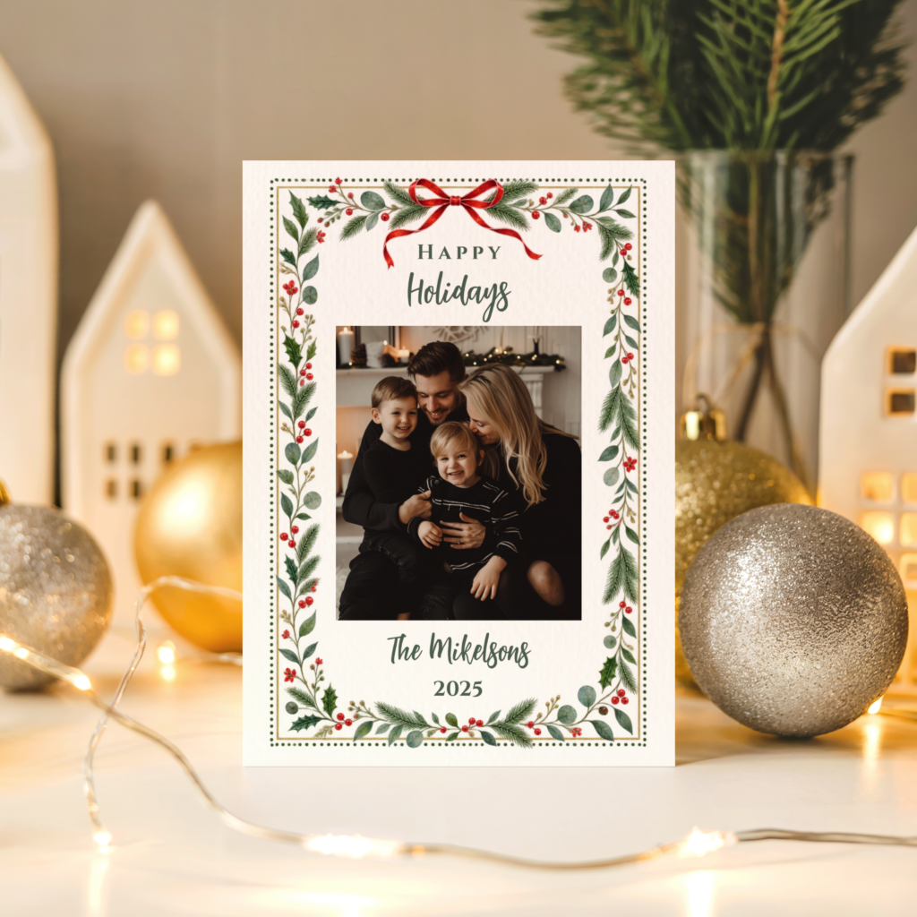
Vintage Christmas cards from Lush Party Boutique — heirloom illustration in deep cranberry, warm cream, and antique gold.
Section 02Three Vintage Christmas Card Styles — Which Era to Choose
Three distinct vintage style directions, each anchored in a specific illustration tradition. The right choice depends on the aesthetic the card should communicate and the recipient list it is going to.
1950s Retro — Bold Flat-Print Graphics
The vintage christmas card of the 1950s is one of the most recognisable design periods in the history of holiday graphics — bold, optimistic, and characterised by the flat colour fields and simplified forms of mid-century screen printing. A 1950s retro vintage christmas card uses a limited colour palette (typically three to five colours), strong outlines, and a graphic energy that reads as warm rather than refined. The text is typically large and confident, set in a script or bold display face that belongs specifically to the decade. This direction is the most immediately recognisable as vintage-specific and the most likely to generate a specific response from recipients who grew up with this aesthetic or who collect mid-century design.
Victorian-Inspired — Ornate Engraved Illustration
The Victorian vintage christmas greeting card occupies the opposite end of the vintage spectrum: fine engraved illustration detail, ornate borders, elaborate compositional arrangements of holly, robin, snow scene, and seasonal botanical elements. The palette is deep and warm — burgundy, forest green, warm ivory, and the specific warm gold of a Victorian print — and the overall effect reads as specifically nineteenth-century rather than mid-twentieth. This direction is the most formally beautiful of the three and the one most likely to be kept rather than discarded after the season. It is also the most appropriate for a recipient list that appreciates craftsmanship and historical detail.
Storybook Nostalgic — A Softer Middle Ground
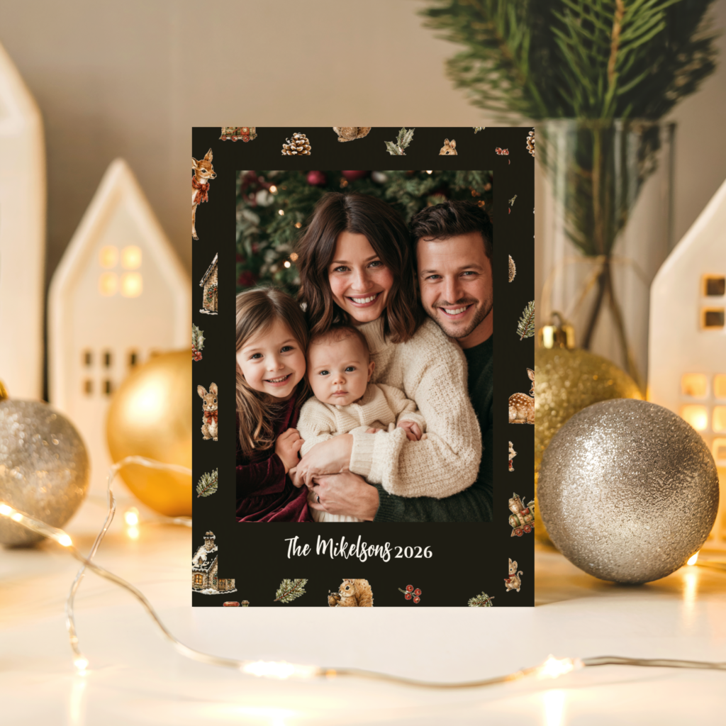
Between the graphic boldness of 1950s retro and the ornate detail of Victorian illustration sits a third vintage direction: the soft, warm nostalgic illustration style of the mid-century children’s book. Rounded illustrated characters, a warm and slightly dreamy palette of deep red, cream, and warm green, and the specific quality of a card that feels as though it came from a family’s collection rather than from a shop. This is the most broadly appealing of the three vintage christmas card directions — warm enough for family recipients, illustrated enough for design-conscious ones, and nostalgic in a way that lands across a wide age range.
✨ Styling Tip
If you are sending to family members who will genuinely appreciate era-specific detail — grandparents, collectors, people who actually lived through the 1950s — lean fully into the specific visual language of the era you choose. This audience notices and appreciates authenticity. A vintage christmas card that commits to one era’s exact illustration style, palette, and typography reads to this audience as a genuinely special card. One that only vaguely references ‘vintage’ reads as a missed opportunity.
Retro Christmas cards from Lush Party Boutique — bold 1950s flat-print graphics in the most era-specific vintage christmas card direction.
Storybook Christmas cards from Lush Party Boutique — soft nostalgic illustration in the warmest and most broadly appealing vintage card direction.
Section 03Pairing Vintage Christmas Cards with Matching Invitations and Decor
A vintage christmas card sends a specific aesthetic signal. When the party invitation that preceded it belonged to the same visual world — the same illustration style, the same muted period palette, the same typographic sensibility — the whole season reads as designed rather than assembled. This is the practical advantage of choosing a collection that offers multiple formats within the same design.
Every collection at Lush Party Boutique is available across invitation, card, and decor formats within the same design direction. A Vintage Christmas party invitation in November, a Vintage Christmas table setting in December, and a Vintage Christmas greeting card sent after the season all belong to the same warm, heirloom world. The cumulative effect — a recipient who receives the invitation, attends the party, and then receives the card — is of a season that was specifically and thoughtfully designed rather than decorated with whatever was available.
For a vintage-themed Christmas party specifically: the Classic Christmas collection offers the most formally elegant version of the traditional palette, with rich red and gold in a register that reads as specifically timeless rather than era-dated. It pairs naturally with deep red table linens, gold candleholders, and botanical greenery as the decor direction.
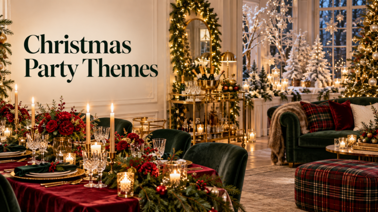
Classic Christmas invitations and decor from Lush Party Boutique — traditional elegance in rich red and gold for the vintage-themed Christmas party.
Frequently Asked Questions
What is the difference between vintage and retro Christmas card styles?
In common usage the two terms overlap, but they refer to slightly different eras and aesthetics. Vintage christmas cards in the broadest sense encompasses anything with a period illustration style — Victorian, 1930s, 1940s, or 1950s. Retro christmas cards specifically refers to the 1950s and 1960s mid-century graphic design style: bold flat-print colour fields, simplified illustration, confident typography, and the specific optimistic energy of that era’s commercial graphics. A Victorian vintage christmas card is ornate and detailed where a 1950s retro christmas card is bold and graphic. Both are vintage in the sense of being era-specific; retro is the more precise term for the specific mid-century direction.
Does a vintage christmas card work well with a modern family photo?
It depends on the vintage direction. A Victorian-style vintage christmas greeting card with elaborate ornamental borders around a modern photograph creates a visual tension that some people find charming and others find mismatched. The 1950s retro direction works rather better with a contemporary photograph: the bold, graphic quality of the design frames a modern photo in a way that reads as intentionally designed rather than aesthetically inconsistent. The Storybook nostalgic direction is the most forgiving with photographs — its soft, warm illustration style frames a family photo naturally. If the card is going to include a photograph, the Storybook or Retro directions are more reliable choices than a fully Victorian-detailed vintage design.
Can I get matching decor in the same vintage christmas card design?
Yes — every collection at Lush Party Boutique is available across multiple formats within the same design direction, including invitation, party decor elements, and greeting card. Ordering the Vintage Christmas or Retro Christmas party invitation from the same collection as the greeting card means every piece the recipient encounters belongs to the same period illustration style, the same muted aged palette, and the same typographic sensibility. The result is a season where the card and the party decor feel like they belong to the same designed world rather than to separately sourced seasonal pieces.
Lush Party Boutique · Vintage Christmas Cards
Shop Vintage & Retro Christmas Collections
Heirloom illustration, 1950s flat-print graphics, and nostalgic storybook warmth — vintage christmas cards at Lush Party Boutique.