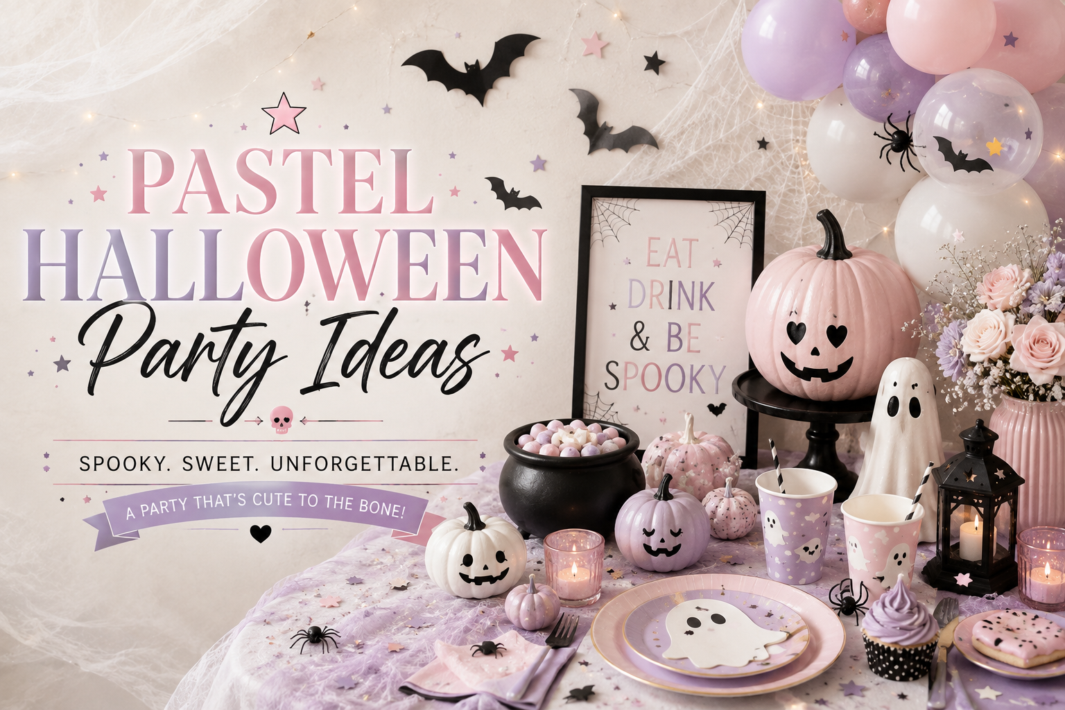
Pastel Halloween Party Ideas
Halloween Party Ideas · Pastel & Soft
Pastel Halloween Party Ideas
The multi-pastel palette rule, the soft-edge illustration principle, the complete decor guide, and the birthday crossover angle for the softest Halloween direction available.
Pastel Halloween is Halloween in soft focus — every motif that would be bold in standard Halloween becomes gentle here: a lavender pumpkin instead of a bright orange one, a blush ghost with a soft watercolour edge instead of a bold black outline, a mint bat rendered in watercolour wash instead of a crisp graphic silhouette. The result is a celebration that is clearly and specifically Halloween — pumpkins, ghosts, bats, and webs are all present — but rendered in a palette and an illustration style that communicate warmth, softness, and celebration rather than atmosphere or fright. It is the most immediately approachable of all the Halloween directions and the one that works most naturally as a birthday crossover for young guests.
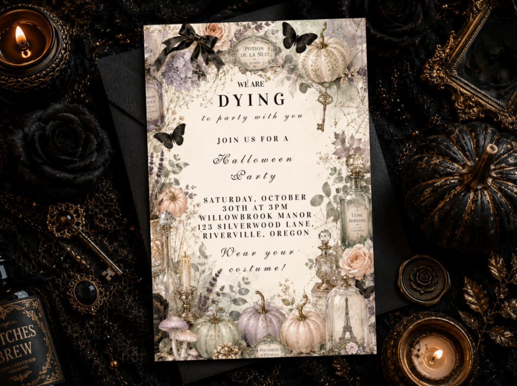
Shop the Pastel Halloween collection.
Invitations, banners, and favour tags in the lavender, mint, blush, and cream palette.
“Halloween in soft focus — spooky without a single shadow. The lavender pumpkin, the blush ghost, the mint bat in watercolour wash. All the motifs, none of the dark.”
Section 01 What Makes Pastel Halloween Distinct — Tint, Not Hue
Pastel Halloween is the only Halloween direction defined by tint rather than by hue or by palette restriction. Every other Halloween direction is defined by what colours are in the palette (pink and black; vintage mustard and sienna; deep charcoal and orange accent). Pastel Halloween is defined by how much white is mixed into whatever colours appear — which means every Halloween motif is present, but all of them at a significantly reduced saturation. Three rules establish the distinction between a genuinely pastel Halloween aesthetic and a direction that is simply lighter-coloured.
Rule 1
Multi-Pastel Palette — Lavender, Mint, and Blush Together, Not Just One
Avoid: A single pastel tone throughout — an all-blush Halloween or an all-lavender Halloween. This reads as a monochromatic party with Halloween motifs rather than as a specifically pastel Halloween direction, because the defining visual quality of pastel is the soft contrast between multiple low-saturation tones. A single pastel applied at full coverage reads as ‘coloured’; multiple pastels at carefully spaced intervals with generous cream ground between them reads as ‘pastel.’
Use: Lavender, soft mint, and blush together — the three-pastel combination that is most consistently associated with the pastel Halloween aesthetic because it provides the maximum tonal variety within the soft-saturation range. Each pastel appears at approximately equal frequency in the balloon cluster, the stationery motifs, and the table accents, so that no single tone dominates and the overall impression is of a gently varied palette rather than of one colour with two supporting notes. Cream is the ground that all three sit on; it provides the white space that makes each pastel visible as a tint rather than as a full-saturation colour.
Rule 2
No Bold Black Outlines — Soft-Edged and Watercolour-Rendered Only
Avoid: Halloween motifs with strong black outlines or graphic silhouettes — even when coloured in pastel tones. A bold-outlined ghost filled with lavender reads as a pastel-coloured graphic, not as a pastel Halloween motif. The black outline itself carries the graphic energy of classic Halloween illustration and prevents the soft reading that the pastel palette is trying to establish.
Use: Soft-edged, watercolour-rendered motifs in which the edge of each shape fades gently into the cream ground rather than being contained by a defined line. A blush pumpkin in watercolour wash with soft edges that bleed slightly into the surrounding cream. A lavender ghost with the watercolour texture visible in the body of the shape and no outline at the perimeter. A mint bat with slightly transparent wing edges. The soft edge is the technique that produces the ‘pastel’ read — not the colour alone.
Rule 3
White Space Does the Work — More Cream Ground, Not Less
Avoid: Covering the full surface of an invitation, banner, or table element with pastel colour at full coverage. Full-coverage pastel reads as a solid-coloured item that happens to be in a soft colour — it loses the specifically pastel quality, which depends on generous cream or white space around each motif to register the tint by contrast with the surrounding lightness.
Use: Generous cream ground between every motif, every piece of text, and every decorative element. The pastel motifs are islands in a cream sea rather than elements in a pastel-coloured field. This is the same principle that governs watercolour illustration more broadly: the white of the paper (or the cream of the card stock) is itself part of the design, not merely the background to be covered. More cream ground around each element, not less, is what produces the specifically airy and soft quality that the pastel Halloween direction requires.
🌱 Styling Tip
If a design still reads as ‘Halloween’ with the colour turned to greyscale, it is using bold outlines and recognisable silhouettes — and that is not pastel. Pastel Halloween should rely on soft colour and generous white space, not on strong linework. The pastel pumpkin should barely read as a pumpkin in greyscale; it should read as a soft shape. The colour is doing the identification work that the outline would do in a classic Halloween design.
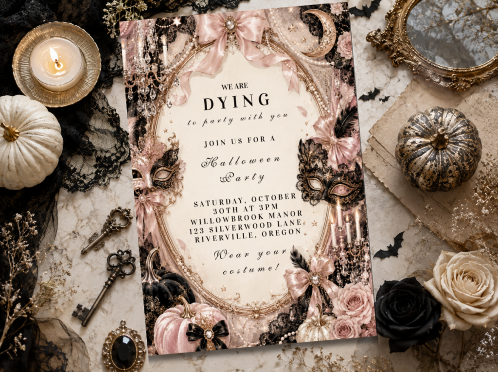
The Pastel Halloween collection carries the multi-pastel, soft-edge illustration style throughout the full stationery and banner range.
Section 02 Pastel Halloween Decor, Cake & Table
Every decor element follows the same three rules: multi-pastel in lavender, mint, and blush; soft edges without bold outlines; cream as the dominant ground.
Soft multi-pastel balloon cluster — the backdrop element
A balloon cluster (not a structured arch — an organic cluster is more consistent with the soft, unstructured quality of the pastel direction) in lavender, soft mint, blush, and warm cream balloons in approximately equal proportion. No bold black balloons, no deep-toned accent — the absence of any dark anchor is what distinguishes the pastel balloon display from the Pink Halloween display, which uses black as its dominant base. The balloons should be matte rather than glossy; glossy finishes read as commercial party supply and break the soft, slightly hazy quality that the pastel direction requires. Cream balloons at the edges of the cluster, where they read as part of the cream ground rather than as an accent colour.
Watercolour pumpkin-and-ghost centrepiece — the table focal element
A small arrangement of soft-printed or hand-painted decorative pumpkins in lavender, blush, and soft mint beside a round ghost figure in warm cream — the ghost form in warm cream rather than in bright white, which would be too stark against the cream table linen. The pumpkins should be uncarved and placed as decorative objects rather than as lit jack-o’-lanterns; the candle inside a carved pumpkin produces a warm orange glow that is too saturated for the pastel palette. Small dried botanicals in soft cream and pale sage beside the pumpkin grouping — dried pampas tails and small sage sprigs — as the botanical detail. No black ceramic vessels, no dark serving ware in the centrepiece zone — a raw clay or warm cream ceramic vessel if a vessel is needed.
Pastel buttercream cake — no bold black details
A two or three tier cake in ombre pastel buttercream — lavender at the base tier fading through blush to soft mint at the top — or three separate tiers in three individual pastel tones. The decoration: small watercolour-style motifs painted directly onto the buttercream in soft pastel tones (a lavender ghost, a blush pumpkin, a mint bat rendered in edible watercolour paint) with no black outline around any motif. The topper: a small soft-tone ghost figure in warm cream with minimal detail, or a simple flower arrangement in matching pastel dried florals. No bold black fondant bats, no black outline cake decoration — anything that introduces bold dark linework breaks the soft visual register the buttercream is establishing.
Cream linen with lavender, mint, and blush scatter — the table surface
A cream or warm white linen tablecloth as the full table surface — the cream ground that the pastel palette depends on for the soft reading. A scatter of dried lavender sprigs, small blush dried rose petals, and a few small mint-coloured paper or fabric stars distributed lightly down the centre of the table — the scatter should be genuinely light, covering perhaps fifteen percent of the runner zone rather than filling it densely. Three small warm cream ceramic votive holders with pale cream candles at each table zone. No dark linen runner, no black charger plates — any dark element at the table surface would anchor the palette in a direction that is inconsistent with the all-pastel light register.
🌱 Styling Tip
Cap the palette at three pastels — lavender, mint, and blush — plus cream. A fourth pastel tone (peach, pale yellow, sky blue) starts to look like an Easter table rather than a soft Halloween one, because the Easter association intensifies with each additional pastel added. Three pastels plus cream is the maximum; it produces the widest tonal variety while maintaining the specifically Halloween identity through the Halloween motifs rather than through the palette.
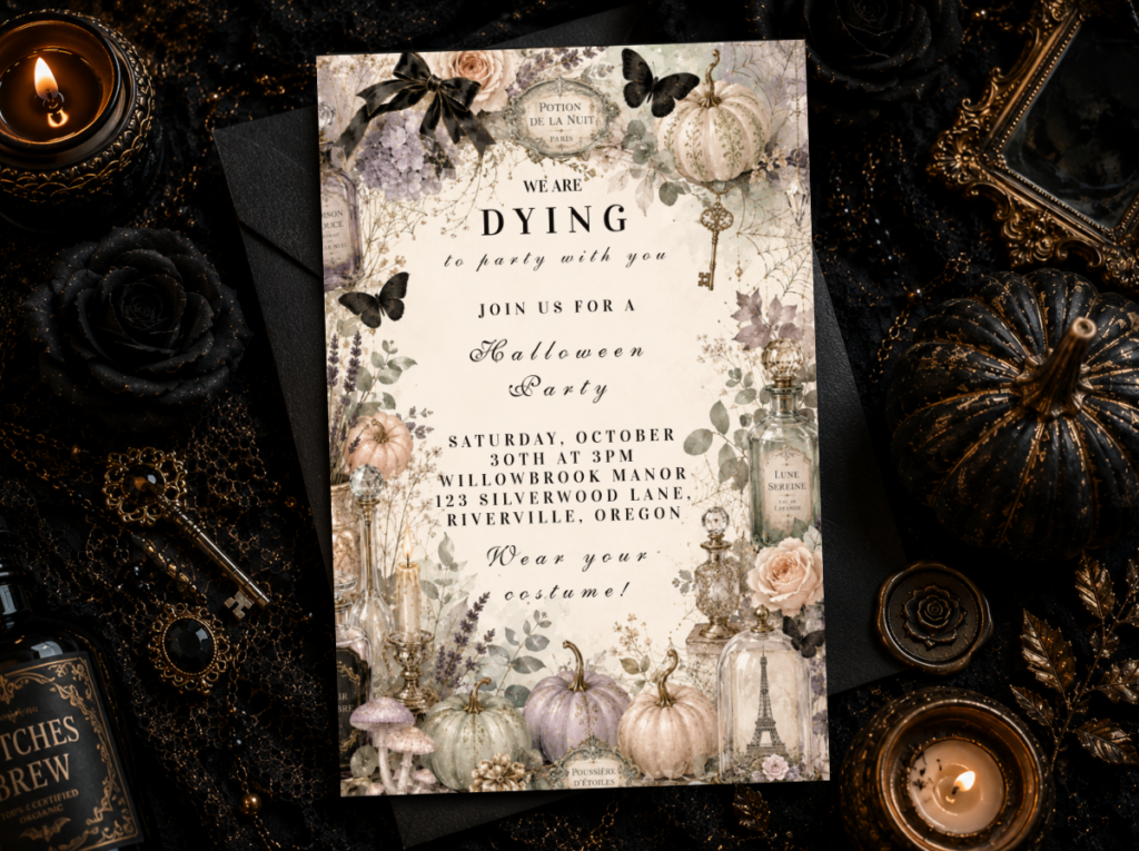
Browse the full Pastel Halloween collection for invitations, table signs, and favour tags in the multi-pastel palette.
Section 03 Pastel Halloween for Birthdays & Young Guests
The pastel Halloween direction is the most naturally birthday-appropriate and the most naturally kid-friendly of all the Halloween directions — not because it has been softened specifically for children, but because the qualities that define it (soft colour, no dark elements, watercolour rendering, generous white space) are the same qualities that produce a warm, celebratory, and specifically non-frightening atmosphere at any age.
For a birthday in October that needs to feel simultaneously like a birthday and like Halloween, the pastel direction handles the overlap more naturally than any other direction. The lavender pumpkin and the blush ghost read as Halloween motifs — so the celebration is clearly seasonally located — but nothing in the palette or the illustration style signals any of the atmospheric or darker qualities that would make Halloween feel inappropriate for young guests. The birthday version adds one gold ‘Happy Birthday’ element — a single antique gold banner or gold letter balloons in matte gold — as the sole addition to the standard pastel Halloween palette without introducing any colour that competes with the pastels.
For very young children (two to five), the pastel direction is appropriate in a way that no other Halloween direction fully is — because it contains no dark elements, no bold silhouettes, and no atmospheric lighting that could be unsettling for guests who are not yet familiar with Halloween as a celebratory context. The ghost is warm cream, not white-and-dark; the bat is soft mint watercolour wash, not a crisp graphic silhouette; the pumpkin is lavender or blush, not a lit jack-o’-lantern. Every motif is Halloween by shape and soft by treatment.
The All Halloween collection provides stationery options across all Halloween directions, including options for birthday crossovers.
Frequently Asked Questions
How is pastel Halloween different from Pink Halloween?
The distinction is structural rather than just tonal. Pink Halloween is a two-colour palette (dusty rose plus black) with a clear hierarchy: black is the dominant anchor, dusty rose is the accent. Pastel Halloween is a multi-pastel palette (lavender, mint, and blush together) with no dark anchor at all — cream is the ground, and all three pastels sit on it at roughly equal prominence without any dark element providing contrast or depth. Pink Halloween uses the contrast between a dark anchor and a soft accent to produce its visual tension; pastel Halloween uses the gentle contrast between multiple soft tones on a light cream ground to produce a completely different quality of softness. They look quite different in practice: Pink Halloween has the drama of high contrast; pastel Halloween has the calm of tonal similarity.
Does pastel Halloween still feel like Halloween or does it read as Easter?
It reads as Halloween when two conditions are met: the Halloween motifs (pumpkins, ghosts, bats, webs) are clearly present in the design, and the palette stays at three pastels maximum. The motifs are the Halloween signal; the soft palette is the pastel signal. When both are present, guests read it as pastel Halloween — because the motifs override the palette’s spring associations. When a fourth pastel is added or when the Halloween motifs become very small or very peripheral, the Easter association intensifies and the Halloween reading weakens. The practical test: if someone who did not know the party was for Halloween could identify at least two Halloween motifs clearly, the Halloween register is maintained regardless of how soft the palette is.
Is pastel Halloween a good theme for young children?
It is the most consistently appropriate Halloween direction for young children of any age, including very young children (two to five years), because it contains no dark elements, no bold silhouettes, and no atmospheric lighting. The ghost is warm cream, not white-against-dark; the bat is soft mint watercolour, not a crisp graphic; the pumpkin is lavender or blush, not a lit jack-o’-lantern. All the Halloween symbols are present in forms that read as gentle and celebratory rather than as seasonally atmospheric. For a first or second Halloween celebration for very young guests, the pastel direction is the correct choice — it introduces the season’s motifs in a register that produces recognition rather than any form of unease.
Spooky in Soft Focus
Pastel Halloween Party Stationery
Invitations, banners, and favour tags in lavender, mint, blush, and cream — every printed element in the soft-edge, watercolour style.