
Pink Christmas Party Ideas
Lush Party Boutique · Christmas Party Ideas 2025
Pink Christmas Party Ideas
The blush-and-gold palette that reads as Christmas, not Valentine’s, with decor and stationery ideas that keep the whole look elegant and calm.
Pink at Christmas works when the palette discipline is right. The version that reads as sophisticated — blush, rose gold, soft cream, and warm gold — has very little in common with the over-saturated candy pink that drifts toward Valentine’s Day territory. The distinction is in the saturation and in the supporting tones: a warm antique gold anchor, cream or white as the neutral base, and blush held at the softest possible reading. Get those three elements right and the pink christmas party looks like a considered departure from tradition rather than an accidental collision of holiday aesthetics.

Featured Collection
Pink Christmas Collection
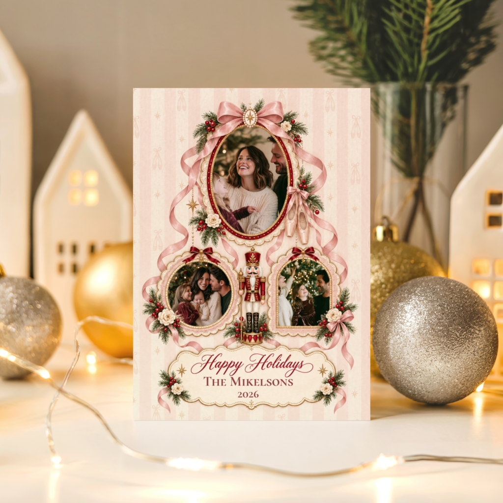
Blush and rose gold christmas party stationery — invitations, cards, and party details in the soft-elegant pink christmas palette.
Four pink and soft-elegant christmas collections from Lush Party Boutique:
Storybook Christmas Collection
Storybook Pink Christmas
Warm storybook illustration in a palette that pairs naturally with blush and cream — the softest and most charming adjacent direction.
“Christmas doesn’t have to be red to feel warm. Blush, gold, and cream can do everything red and green do — just more quietly.”
Section 01What Makes a Pink Christmas Party Distinct
The pink christmas party sits at the intersection of two aesthetics that do not always get along: the warm, traditional register of Christmas and the soft, feminine register of blush and rose gold. Getting the combination right means being specific about all three of the palette decisions that determine whether it reads as elegantly Christmas or accidentally Valentine’s Day.
Blush and rose gold, not bubblegum. The pink that works at Christmas is muted, warm, and reads closer to ivory than to fuchsia. Blush — the specific pale, grey-pink of a faded rose petal — and rose gold — the warm metallic that sits between champagne and copper — are Christmas-compatible because their warmth belongs to the same palette register as candlelight and antique gold. Bright, saturated, or blue-toned pink does not belong to this register and will read as Valentine’s-adjacent no matter how many christmas ornaments surround it.
Gold as the metallic anchor. The same way antique gold ties a white christmas table back to the traditional holiday register, warm gold ties a blush christmas palette to Christmas rather than to any other occasion that uses pink. Rose gold flatware, gold-rimmed glassware, gold candlestick holders: the gold element communicates that this is a christmas celebration with a non-traditional palette, not a generic pink party that happens to include some seasonal decoration.
White or cream as the third tone, never a second bright. A pink christmas palette with a second saturated colour — red, bright green, or even a strong burgundy — becomes too busy to read as soft and elegant. White or warm cream as the third element keeps the palette calm: blush provides the warmth, gold provides the traditional anchor, and cream provides the breathing space that allows both to read clearly. Three tones, all in the same muted register.
✨ Styling Tip
Hold your pink element next to gold and white before committing to it. If the pink reads brighter than a soft blush in that comparison, it is too saturated for a christmas palette and will drift toward Valentine’s Day regardless of the surrounding decoration. The test is simple: if you would use the same pink on a February table, choose a softer tone for December.
Pink Christmas stationery from Lush Party Boutique — blush and rose gold across invitations, party cards, and christmas stationery in the soft-elegant palette direction.
Section 02Decor, Table, and Invitations for a Pink Christmas Party
The pink christmas party reads as elegant when every surface element belongs to the same three-tone palette: blush, gold, and cream. The moment a fourth colour enters — even one that seems seasonally appropriate — the palette loses the calm, considered quality that makes the pink christmas aesthetic work.
Blush-and-gold table setting. Cream linen as the table base, blush cloth napkins folded simply rather than elaborately, and rose gold or antique gold flatware as the only metallic present. Gold-rimmed glassware adds the second gold element at eye level. A single pillar candle in an antique gold holder at each place setting or grouped in threes down the table centre provides the warm light that blush and gold need to read at their most beautiful.
Soft pink ornament clusters. Blush and rose gold ornaments grouped in clusters of three or five rather than distributed individually across the table create the specific visual weight that a centrepiece needs without the height of a traditional floral arrangement. Vary the sizes within each cluster — one larger, two medium, two small — and place each cluster on a small mirror tile or a square of cream satin to give it a defined visual base.
The invitation carries the palette. A blush and rose gold christmas party invitation establishes the palette before any guest arrives — which means guests who walk into a room dressed in blush and gold have been prepared to expect exactly that. Choosing an invitation from the same collection as the other stationery details — place cards, menus, any table signage — keeps the whole visual identity consistent from the first communication to the last element the guest sees on the night.
✨ Styling Tip
Keep the palette to three tones — blush, gold, cream — across every surface simultaneously. The same discipline that makes any signature-colour party read as designed rather than simply decorated is the palette constraint: three tones, held consistently, across linen, candle, ornament, flatware, and stationery alike.
Storybook Christmas stationery from Lush Party Boutique — warm illustrated christmas stationery in tones that sit naturally alongside a blush and gold table.
Section 03A Softer Alternative: White and Minimalist Christmas
The pink christmas palette is not right for every host or every gathering. For those who want the same soft, elegant mood without committing to a non-traditional colour, two directions produce a very similar atmosphere through different means.
White Christmas. A white and gold christmas party occupies the same quiet-elegant register as a pink christmas party but reads as more universally neutral. White linen, gold accents, cream candles: the palette is warmer than it sounds when the gold element is genuinely warm antique gold rather than cool bright gold, and when the white is a warm ivory rather than a pure stark white. This direction photographs beautifully against any outfit colour and works for any guest list, from a formal dinner to a relaxed family gathering.
Minimalist Christmas. The Minimalist christmas direction achieves the same restrained elegance through simplicity rather than through palette: clean geometric motifs, a quiet colour scheme, and the specific calm of a decoration scheme that deliberately uses less rather than more. For a host who finds the pink palette too committing but wants to move away from traditional red and green, minimalist christmas in a white, cream, and warm gold register is the closest alternative that does not require any non-traditional colour decision.
White Christmas stationery from Lush Party Boutique — soft, light-toned christmas stationery for the same quiet-elegant mood without the pink palette commitment.
Minimalist Christmas stationery from Lush Party Boutique — clean, restrained christmas design for hosts who want elegant simplicity rather than a signature colour direction.
Frequently Asked Questions
How do I keep a pink Christmas party from looking like Valentine’s Day?
Three things: choose blush rather than bright or warm pink, use antique gold as the metallic anchor rather than red or silver, and keep cream or white as the only neutral. The combination of blush, antique gold, and cream sits firmly in the Christmas register because gold is a traditional Christmas metallic and cream reads as seasonal warmth rather than romantic freshness. Avoid any red elements alongside the pink — red and pink together reads as Valentine’s Day immediately. And avoid saturated or warm-toned pink: the softer and more muted the blush, the more clearly it reads as Christmas.
Does pink work for a family christmas party, or is it better for an adult gathering?
A blush and gold christmas aesthetic works best for adult gatherings or parties where the guest list is adults-primarily. Young children do not necessarily cause problems with the palette, but the restrained, elegant register of the pink christmas direction is primarily designed to appeal to adult taste. For a family gathering with young children, the Storybook Christmas direction — which uses warm illustrated motifs that appeal across age groups — produces a similarly soft and charming mood without the adult-specific elegance register. The White Christmas direction is also more universally appealing across ages than the pink palette.
What metallic pairs best with pink for Christmas?
Antique gold or warm rose gold. Cool silver reads as contemporary and slightly clinical next to blush and will push the palette toward a modern aesthetic that does not read as Christmas. Bright or yellow gold can work but reads better at a smaller scale — in a frame, a small ornament, a thin ribbon — than as the dominant metallic. Antique gold — the specific warm amber-gold of aged metal — is the most natural christmas metallic and the one that ties a blush palette most reliably back to the traditional holiday register without competing with the pink element.
Lush Party Boutique · Pink Christmas Collections 2025
Shop Pink and Soft Christmas Collections
Blush, rose gold, white, and soft-elegant christmas stationery — all at Lush Party Boutique.