Dark & Moody Halloween Party Ideas
Halloween · Dark & Moody Party Guide
Dark & Moody Halloween Party Ideas
Deep jewel tones, glass apothecary props, dripped candles, and the romantic-gothic register that separates a dark and moody Halloween party from generic gothic or novelty witch decoration.
The dark and moody Halloween party occupies a specific and often misunderstood position in the Halloween style spectrum. It is not the horror-forward Spooky and Scary direction, which prioritises atmosphere and fright over aesthetic coherence. It is not the Glam direction, which uses black-and-gold art-deco geometry. It is the romantic-gothic direction: deep jewel tones, glass and aged-metal objects, dried botanical texture, candlelight, and the specific visual register of a witch’s parlour that belongs to a world of beautiful objects rather than a world of novelty props. The key word is ‘beautiful’ — every element in a dark and moody Halloween party should be beautiful before it is spooky.
The distinction matters because the material quality of the props is everything in this direction. A glass apothecary bottle filled with dried herbs beside a dripping taper candle communicates ‘dark and moody’ with immediate clarity. A plastic cauldron from a seasonal aisle communicates ‘Halloween party’ in the generic register — and no amount of jewel-tone linen or moody lighting can rescue a plastic prop once it has been placed on the table.
⚠ This post contains affiliate links. As an Amazon Associate, I earn from qualifying purchases at no extra cost to you. I only recommend products I genuinely believe will add value for my readers. Thank you for supporting Lush Party Boutique.
Browse the Dark & Moody Halloween collection — party stationery in the romantic-gothic jewel-tone palette.
“Something wicked, beautifully styled — where plum and midnight purple carry the mood, the candle drips tell the story, and every glass bottle on the table is a designed object rather than a seasonal prop.”
Section 01 What Makes the Dark & Moody Direction Distinct
Three specific characteristics separate the dark and moody Halloween party from adjacent directions — and all three are about material quality and colour discipline rather than about accumulating Halloween-themed objects.
Distinction 1
Deep Jewel Tones as the Dominant Palette — Black as Support Only
The dark and moody Halloween palette is plum, midnight purple, deep emerald, and aged gold — with black as a supporting tone rather than as the dominant surface colour. This is a critical distinction from both the Glam direction (which is black-and-gold as an equal two-tone system) and from generic gothic Halloween (which is predominantly black with orange or purple accents). In the dark and moody direction, deep plum covers more table surface than black does. Midnight purple appears in the linen, the candle wax, and the floral elements as the dominant chromatic presence. Black recedes to the edges: the candlestick bases, the raven feather accent, the invitation envelope. When this ratio is reversed — when black covers more surface than plum — the direction slides into generic gothic Halloween and loses the specific romantic-moody quality that distinguishes it.
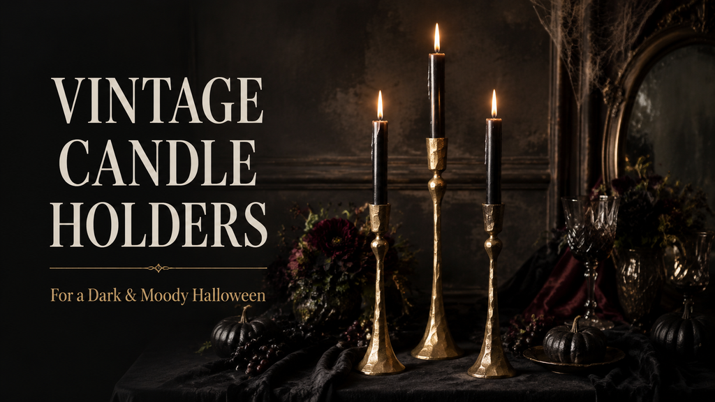
🕯 Aged-brass or verdigris taper candlestick holders: These are what separate a designed tablescape from a party-supply one — vary the heights across three or four candlesticks down the table for the layered, moody look this theme calls for. An aged brass or verdigris finish reads as antique, never shiny or new.
Distinction 2
Apothecary and Botanical Props as Beautiful Objects — Not Novelty Witch Props
The dark and moody direction communicates its Halloween identity through objects that are beautiful in their own right: glass apothecary bottles in varying heights filled with dried herbs, dried flower heads, or deep-toned dried botanicals; vintage-style glass or ceramic vessels as the centrepiece anchor; dripping taper candles in deep plum or ivory in aged-brass or verdigris candlestick holders; dried botanical bundles in deep plum, dried lavender, dried black-tinted roses. None of these objects reads as a novelty Halloween prop; each reads as a designed object that communicates the dark and moody aesthetic through its material quality and its placement. Plastic cauldrons, novelty witch hats, mass-produced spider web garlands, and pre-made ‘potion bottle’ sets in bright plastic are incompatible with this direction regardless of their colour. The material quality of each prop is more important than its thematic reference.
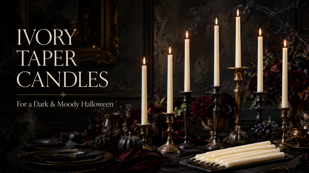
🕯 Dripping taper candles: The deliberate wax-drip look is a signature detail of this theme, echoed on both the table and the cake. Ivory tapers let the drip show clearly against dark linens, and they’re reusable across future moody tablescapes.
Distinction 3
Romantic and Atmospheric Over Horror — Moody Lighting, Not Shock Effects
The dark and moody Halloween direction is romantic rather than frightening — its atmosphere is produced by candlelight, jewel-tone depth, and botanical texture rather than by horror staging or shock effects. Fog machines belong to the Spooky and Scary direction; jump-scare elements belong there too. The dark and moody party creates its atmosphere through sensory richness rather than through fear: the smell of dried herbs and beeswax candles, the visual depth of plum linen and aged brass, the flickering quality of candlelight on glass bottle surfaces. The guest experience is immersive rather than startling, and the aesthetic communicates a world of dark beauty rather than a world of horror.
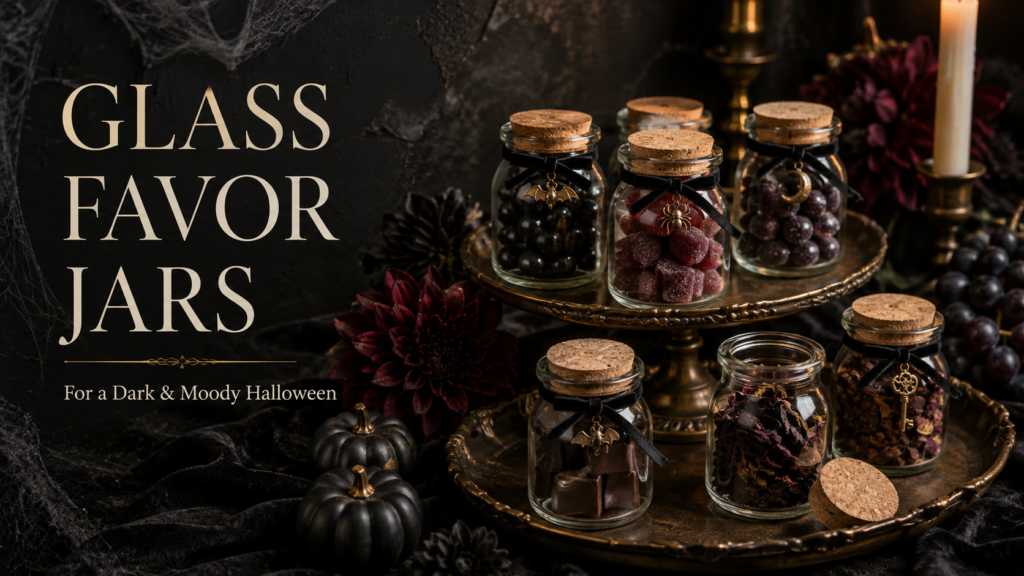
🫙 Glass apothecary bottles/jars set: Grouped in odd numbers at varying heights, these hold the dried botanicals that anchor every centerpiece in this style. Clear glass keeps the focus on what’s inside rather than competing with it.
🕯 Styling Tip
One glass apothecary bottle filled with dried botanicals and a dripped taper candle beside it reads as a specifically designed dark and moody aesthetic. A shelf of pre-made plastic ‘potion prop’ sets reads as a seasonal party-supply display. The material difference — glass versus plastic, real dried botanical versus synthetic — is visible at a glance and determines whether the direction reads as designed or as generic. Every prop in this direction should be chosen for its material quality first and its thematic reference second.

The Dark & Moody Halloween collection — party stationery in the romantic-gothic jewel-tone palette.
Section 02 Décor, Cake & Table
Every element of a dark and moody Halloween table should pass a single test: is this object beautiful on its own terms, independent of its Halloween reference? If the answer is yes, it belongs. If the object’s primary identity is as a Halloween prop rather than as a beautiful designed object, it belongs in a different direction.
Table setting: Deep plum velvet or deep jewel-tone linen as the primary tablecloth — plum covering the most surface area, with black used only at the textile edges or as the napkin colour. Aged-brass or verdigris candlesticks at three heights with dripping taper candles in deep plum or ivory — the candle wax drips are a design detail, not a mess; they communicate the moody, atmospheric register of the direction with no additional styling required. Vintage-style glassware in dark amber or deep plum tones. Dark ceramic or aged-metal charger plates. Black or deep plum napkins, simply folded.
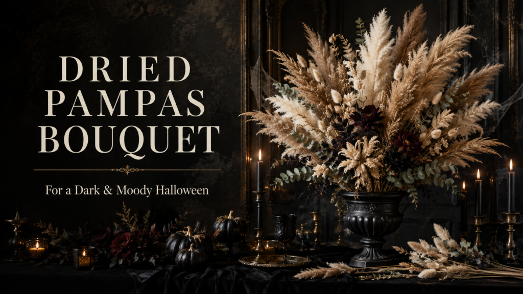
🌾 Dried floral arrangement/bundle: Dried stems in dusty, muted tones are what keep this theme feeling elegant rather than seasonal-cute — no fresh flowers, no bright color. Fill the apothecary bottles or lay pieces flat along the table runner.
Centrepiece: A cluster of glass apothecary bottles in three heights at the table centre — each filled with a different dried botanical: dried lavender, dried rose heads in deep burgundy, dried sage, dried wormwood or artemisia in silvery green. A single dark dried floral arrangement beside the bottle cluster — deep burgundy dried roses, dried black-tinted calla leaves, aged-gold dried foliage. Moon and star accent pieces in aged gold placed at the base level beside the bottles — a flat ceramic moon disc, a small brass star cluster — as the single thematic reference that communicates the witch and gothic aesthetic without introducing any novelty prop.
Cake: A two-tier smooth-finish cake in midnight purple or deep plum buttercream with a deliberate candle-wax drip detail at the top tier edge — dark dripping wax in deep plum over a slightly lighter purple base. Dried botanical topper: dried lavender sprigs, a small dried rose head in deep burgundy, and a small aged-gold moon charm or star pick. No novelty topper, no skull decoration, no Halloween iconography — the colour and the botanical detail communicate the direction entirely. The cake should read as a dark, beautiful object rather than as a decorated Halloween dessert.
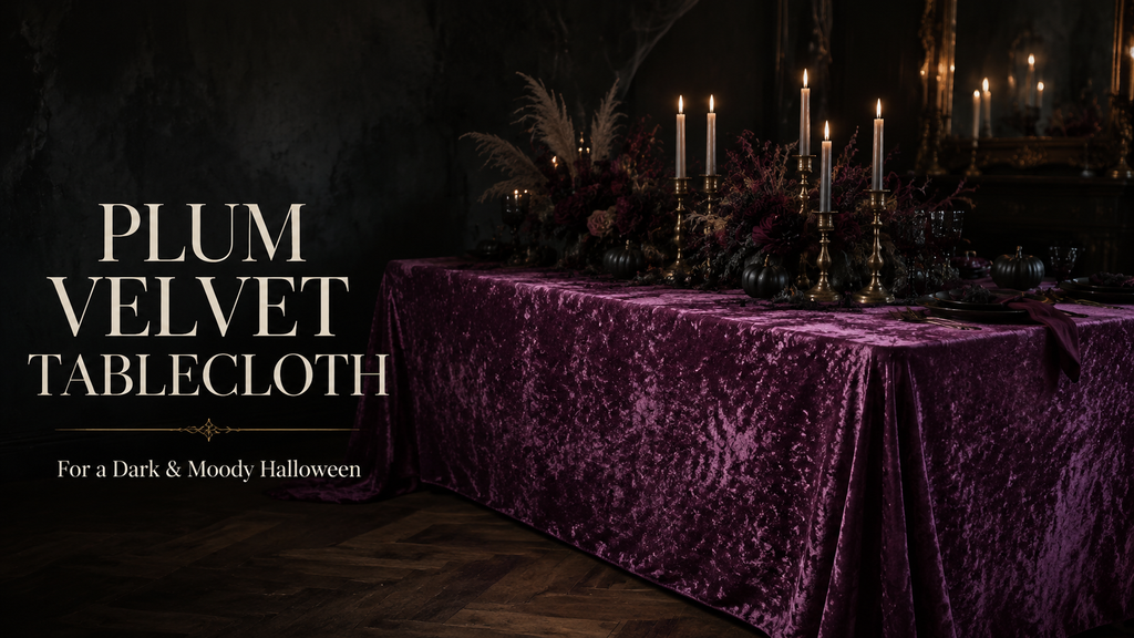
🟣 Deep plum or jewel-tone velvet tablecloth: The article’s core argument is that color should come from the table surface, not from black — a rich plum or jewel-tone velvet covers more visual area than any other single piece and sets the whole palette instantly.
🕯 Styling Tip
Keep black as a supporting colour, never the base. Plum or midnight purple should cover more surface area than black at every zone of the party — the tablecloth, the candles, the balloon arch if used, the cake. Reverse that ratio — more black than plum — and the direction slides from romantic-gothic into generic gothic Halloween, which is a much more common and much less distinct aesthetic. The jewel tone is the design decision; the black is the shadow that makes it deeper.
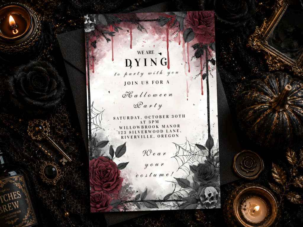
The Dark & Moody Halloween collection — jewel-tone party stationery for the romantic-gothic direction.
Section 03 Invitations & Favours
The invitation and the favour are the two elements of the dark and moody Halloween party that guests interact with most directly — one arrives weeks before the party, one leaves with every guest — and both should carry the same jewel-tone, botanical, designed-object quality as the decoration.
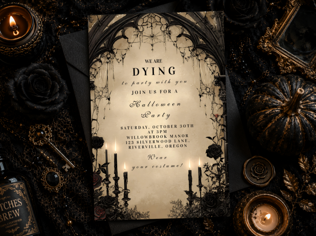
Invitation: A dark and moody Halloween invitation should carry the jewel-tone palette as its primary visual statement — deep plum or midnight purple as the dominant ground, aged-gold typography, and a moon-and-botanical illustration detail that communicates the direction without novelty Halloween iconography. A wax seal in aged gold or deep plum on the envelope — the specific detail that communicates the quality register of the event before the envelope is opened. The wording should be atmospheric rather than generic: ‘You are invited to a Midnight Garden’ or ‘Join us on All Hallows’ Eve’ rather than ‘Halloween Party!’ The wording register is part of the aesthetic.
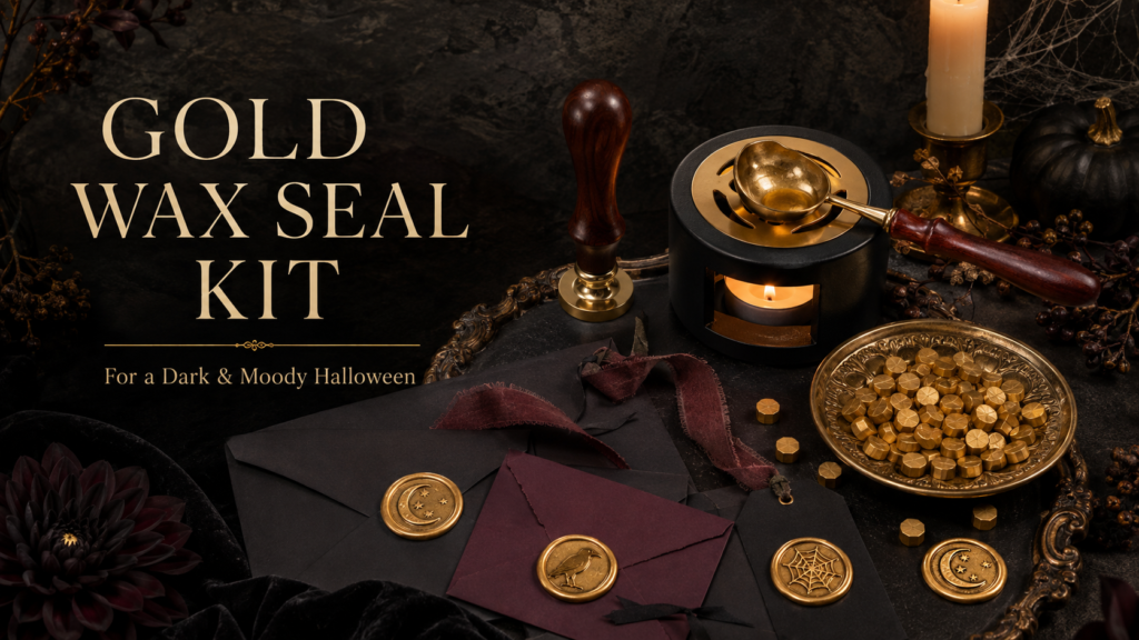
🖋 Wax seal stamp kit (aged gold): Wax seals on invitations and favor tags are what push the stationery from printed to bespoke, echoing the aged-gold accents used throughout the theme. A kit with wax and stamp together makes it a one-purchase setup.
Favours: Two favour approaches work within the dark and moody direction. The first: a small glass vial or glass apothecary bottle filled with dried botanicals or loose dried herbs — sage, lavender, dried rose petals — sealed with a dark wax seal and labelled with a small kraft or dark card tag in the event’s typeface and palette. The material quality of the glass vial carries the designed-object quality of the whole direction into the take-home favour. The second: a small wrapped artisan candle in the event’s jewel-tone palette — deep plum or aged ivory — with a custom apothecary-style label in the invitation’s typography. Both approaches produce a favour that guests keep rather than discard, because both read as a designed object rather than as a themed party favour.
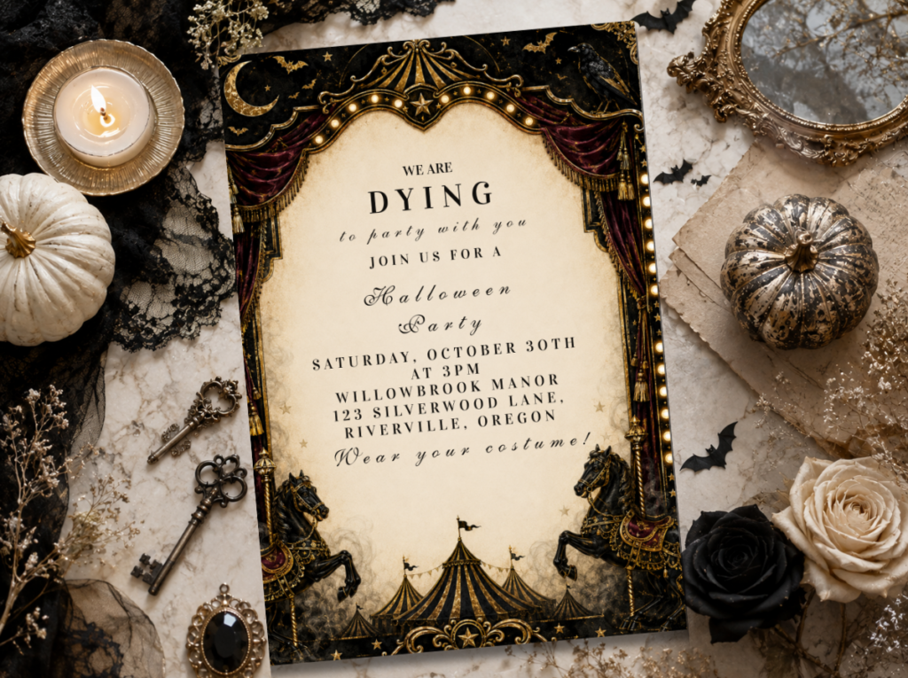
Browse the full Halloween stationery range for every direction — dark and moody, masquerade, glam, monster, and more.
Frequently Asked Questions
How is the dark and moody direction different from Glam Halloween?
Three clear distinctions separate them. The Glam Halloween direction uses a strict two-colour system — black and metallic gold — with art-deco geometry as its primary design language. The dark and moody direction uses a jewel-tone palette — plum, midnight purple, deep emerald — with black as a supporting tone and with botanical texture rather than geometric pattern as the primary design language. Glam Halloween borrows from art-deco and black-tie events; dark and moody borrows from the romantic-gothic tradition of the apothecary, the botanical cabinet, and the candlelit witch’s parlour. Glam reads as chic; dark and moody reads as atmospheric and beautiful. Both are elegant — they are elegant in different registers.
What’s the difference between a witch-themed party and generic gothic Halloween?
The witch Halloween party in the dark and moody direction is characterised by the quality and the material language of its props: glass apothecary bottles, dried botanical bundles, beeswax candles in aged-brass holders, and a jewel-tone palette where plum dominates over black. Generic gothic Halloween is characterised by the reverse: black as the dominant tone, novelty props (plastic cauldrons, novelty witch hats, commercial spider web garlands), and the Halloween iconography applied as decoration rather than as the design language itself. The witch-themed party in this direction treats the witch aesthetic as an art direction — a world of beautiful dark objects — rather than as a costume theme applied to a generic party format. The test: if every prop in the room could be purchased at a seasonal Halloween aisle, it is generic gothic. If every prop reads as a designed object that happens to belong to the Halloween aesthetic, it is dark and moody.
How do I keep dark and moody props looking designed rather than novelty-store?
Three sourcing decisions consistently produce the designed result. First, material: glass, ceramic, aged brass, and dried botanical always read as designed; plastic, bright synthetic, and mass-produced novelty always read as party-supply regardless of how they are arranged. Second, restraint in quantity: five well-chosen glass bottles communicate the aesthetic more effectively than twenty novelty props. Third, negative space: a designed object is defined by the empty space around it as much as by the object itself — a glass apothecary bottle on a plum tablecloth with a dripping candle beside it and empty space on either side reads as a composed still life. The same bottle surrounded by fifteen other props reads as accumulation. Fewer objects, better material, more space between them: this is the consistent formula for keeping the dark and moody direction reading as designed.
Plum · Midnight Purple · Glass & Botanicals
Shop the Dark & Moody Halloween Collections
Romantic-gothic Halloween party stationery in deep plum and midnight purple — invitations, place cards, and wax-seal envelopes for the witch and gothic direction.