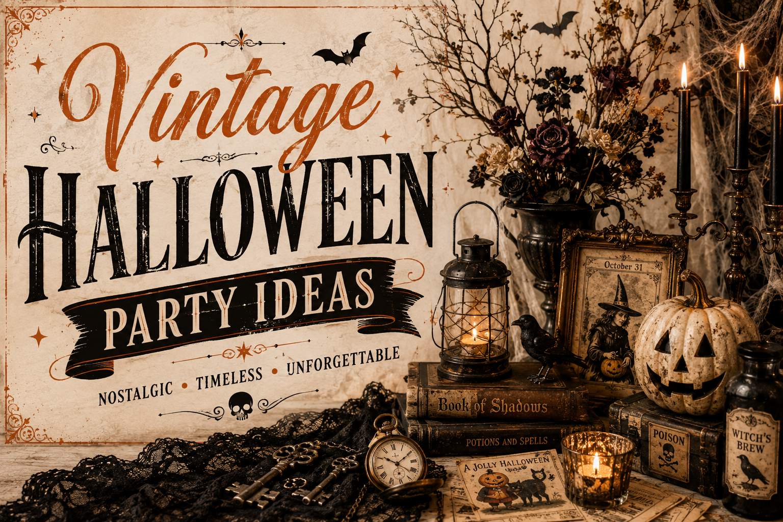
Vintage Halloween Party Ideas
Halloween Party Ideas · Vintage & Retro
Vintage Halloween Party Ideas
The three rules that make a design read as genuinely vintage, the decor and table guide, the stationery brief, and every detail in the muted mustard and sienna palette.
Vintage Halloween is the Halloween direction with the most specific visual requirements and the most immediately recognisable result. It is the Halloween your grandmother’s party actually looked like — not photographed and filtered through a nostalgia lens, but flat-printed, paper-cutout, screen-printed on a card stock that has weight and warmth to it. The muted mustard and sienna palette, the simplified black cat and paper-lantern moon, the folded-paper bat in two colours maximum — these are not aesthetic choices available for mixing with modern design elements. They are a complete and closed visual system, and the moment a modern gradient or a sepia-filtered photograph enters the room alongside them, the vintage read dissolves.
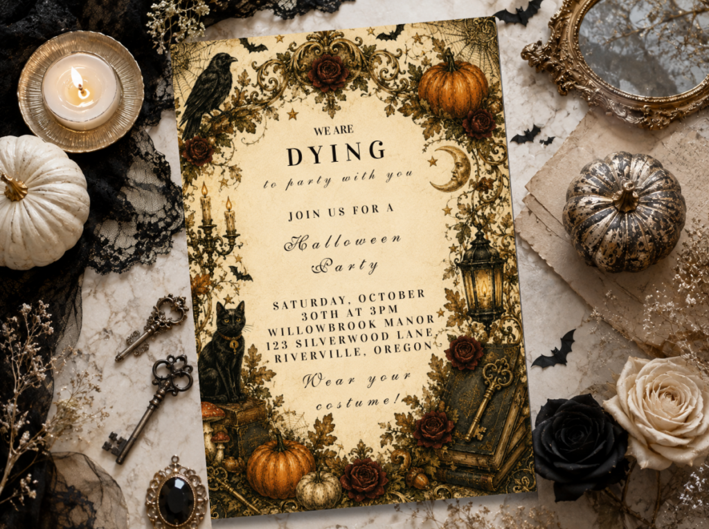
Shop the Vintage & Retro Halloween collection.
Invitations, banners, and favour tags in the muted mustard and sienna mid-century palette.
“The Halloween your grandmother’s Halloween party actually looked like — flat-printed, paper-cutout, two colours and a warm cream ground. Not filtered. Not rendered. Just printed.”
Section 01 What Makes Vintage Halloween Distinct — Three Non-Negotiables
Rule 1
Mid-Century Flat-Print Illustration Only
Not this: Modern gradient illustrations with shading, dimensional rendering, photographic elements, or 3D-style clipart — even when desaturated to the correct vintage palette tones. These communicate ‘contemporary design in vintage colours’ rather than ‘vintage design.’ A gradient-shaded pumpkin in muted orange does not read as vintage; a flat two-colour linework pumpkin in the same tones does.
This: Flat-print illustration in the 1950s–60s screen-print style: limited colour count (two to three tones per illustration maximum), clear linework without gradient fills, simplified shapes with the specific quality of a hand-separated screen print. The black cat should be a solid silhouette with minimal interior detail. The bat should read as folded paper. The moon should be a flat disc, not a rendered sphere. Every illustration should look like it was produced by a commercial print shop in 1962 using three screens.
Rule 2
Muted Mustard, Sienna, and Warm Cream Palette — No Bright Orange, No Neon
Not this: Bright pumpkin orange, neon green, or cool-toned black-and-white. Bright orange is the colour of modern commercial Halloween — it communicates the present rather than the past, regardless of the illustration style placed beside it. Adding a sepia Instagram filter to a modern Halloween design also does not produce a vintage read; it produces a filtered modern design.
This: Muted mustard — the specific warm yellow-brown that sits between ochre and gold — as the primary warm tone. Sienna and aged rust as the secondary warm tone. Warm cream as the ground. Dark brown or desaturated near-black as the dark tone in place of pure black. The vintage read comes from desaturation and from the warm undertone of every element — not from any filter or colour grading applied after the fact.
Rule 3
Period-Accurate Motifs — No Realistic Illustration, No Licensed-Character-Adjacent Design
Not this: Realistically illustrated pumpkins with dimensional shading, portrait-style cat illustrations, or any motif that approaches the visual territory of an existing licensed character. Realism was not a feature of mid-century commercial Halloween print; it belongs to a different and more contemporary aesthetic entirely.
This: Simplified, flat, period-accurate motifs: the solid-silhouette black cat in profile with a curved tail; the half-moon paper lantern in two flat tones; the folded-paper bat with a wingspan that reads as symmetric and graphic rather than naturalistic; the owl in a flat round form; the witch’s hat as a simple geometric silhouette. Each motif should be reducible to a two-colour screen print without any loss of legibility or character.
🎃 Styling Tip
A vintage Halloween element should look like it was screen-printed in 1962, not photographed and run through a sepia filter. Flat shapes and a limited colour count are what read as vintage — not a brown tint over a modern illustration. The test: reduce the design to two colours. If it still reads clearly and beautifully, it belongs to the vintage direction. If it loses its character, it was relying on modern rendering techniques that the vintage register cannot support.
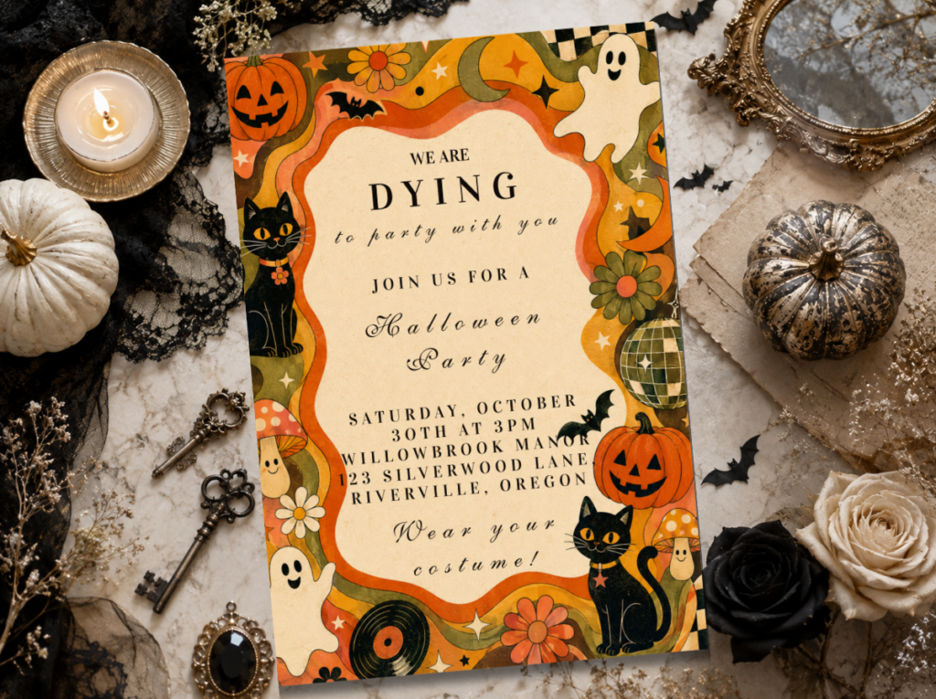
The Vintage & Retro Halloween collection carries the mid-century flat-print illustration vocabulary throughout the full stationery suite.
Section 02 Vintage Halloween Decor & Table
Every decor element follows the same flat-print principle as the stationery — paper, print, and warm muted tones throughout.
Mustard-and-cream bunting — the primary backdrop element
Triangular bunting flags in muted mustard, warm cream, and sienna — cut from heavyweight kraft or card stock rather than from fabric, so they carry the flat-print quality of a paper decoration rather than the soft quality of a textile one. Each flag can carry a single printed flat motif (a bat silhouette, a cat profile, a moon disc) or be left plain in the alternating palette tones. Hung across the backdrop zone or along the wall behind the food table as the primary large-scale decoration element. Paper bunting in the vintage palette communicates the mid-century party decoration aesthetic with complete clarity and at significantly lower cost than any fabric alternative.
Paper-lantern moon garland — the lighting and decoration element combined
Round paper lanterns in muted mustard and warm cream, strung at varying heights across the backdrop or above the table — each lantern a flat-print moon disc in the paper lantern form that was the standard Halloween decoration of the 1950s and 60s. Warm amber bulbs inside each lantern (never cool LED, which breaks the warm tone of the mustard and cream palette). The paper lantern moon garland serves as both the lighting source for the room zone and the primary ceiling-level decoration element. Three to five lanterns in a staggered row read as period-accurate; a single large lantern reads as contemporary.
Mid-century black cat cutouts — flat silhouette, not dimensional
Flat card stock cat silhouettes — the specific arched-back, raised-tail profile of the Halloween cat that was standard in mid-century American party decoration — placed at the table level between serving dishes, at window ledges, and on the mantle or shelf zone. The cutout should be printed or cut from solid dark brown or near-black card stock, not from shiny black material. Shiny black reads as contemporary; matte dark brown reads as period-accurate. Three or four cutouts in the same silhouette distributed across different table zones read as a considered motif; ten cutouts scattered randomly read as generic decoration.
Kraft-paper table runner with sienna accents — the table surface
A plain kraft paper runner down the table centre — the specific warm brown of unbleached kraft paper belongs to the vintage palette naturally without any additional treatment. Stamp or print a repeating flat motif at intervals along the runner (bat silhouette, cat profile, moon disc) in sienna or muted mustard ink. Place serving dishes directly on the runner over small sienna-toned linen squares at each serving position. The kraft paper runner is the most cost-effective vintage Halloween table element available and produces the most period-accurate surface material of any table covering option.
🎃 Styling Tip
Keep every printed element — the banner, the cups, the favour tags, the table runner motif — in the same flat mid-century style. One glossy modern element in the mix breaks the vintage read instantly. A contemporary printed banner beside a period-accurate card stock bunting reads as two different parties sharing a venue. The vintage direction requires complete consistency across every printed surface the guest encounters.
Browse the full Vintage & Retro Halloween range for invitations, banners, and table stationery in the muted mustard and sienna palette.
Section 03 Vintage Halloween Invitations & Stationery
The invitation is the first printed element the guest encounters and the one that establishes the aesthetic register before any decoration is seen. For a Vintage Halloween party, the invitation must carry the flat-print illustration style, the muted mustard and sienna palette, and a period-accurate motif as the primary graphic element — a simplified black cat silhouette, a paper-lantern moon, a flat-print bat — or the party’s vintage read is compromised before it begins.
The full stationery suite — invitation, envelope, banner, favour tag — should share the same illustration style, the same palette, and the same typography register. Mid-century Halloween typography uses bold display serif or woodblock-style lettering in the dark tone of the palette — never a script font (which reads as feminine and contemporary rather than as vintage and graphic) and never a sans-serif font (which reads as modern regardless of the colour it is printed in).
The Vintage & Retro Halloween collection carries the flat-print mid-century illustration style throughout the full stationery range. Browse it alongside the All Halloween collection for the complete range of options available.
Browse both collections for the full range of vintage Halloween stationery options.
Frequently Asked Questions
What makes a design read as ‘vintage’ rather than just orange-and-black?
Two things, in order: illustration method and palette temperature. Illustration method is primary — a flat-print silhouette with a limited colour count reads as vintage regardless of its palette; a gradient-rendered illustration reads as contemporary regardless of how muted its colours are. Palette temperature is secondary — the vintage read requires a warm, desaturated palette (muted mustard, sienna, aged rust, warm cream) rather than the bright, high-contrast palette of commercial modern Halloween (bright orange, pure black, neon green). Both elements must be present simultaneously. A flat-print illustration in bright modern orange reads as ‘retro-style’ without fully committing to the vintage register. A muted palette on a modern gradient illustration reads as ‘autumnal.’ Only flat-print illustration in a muted warm palette reads as specifically vintage Halloween.
Does vintage Halloween work for adult parties or for children too?
Both, with different emphasis. For adult parties, the mid-century graphic aesthetic carries a specific design nostalgia that is increasingly appreciated — the flat-print illustration style references a specific cultural moment and communicates it with precision. For children’s parties, the same visual vocabulary produces a celebration that reads as warm and whimsical rather than atmospheric or horror-adjacent — which makes it one of the most age-appropriate Halloween directions available for younger children. The simplified flat cat silhouette and the paper-lantern moon are universally legible as Halloween without any dark or frightening dimension. The specific palette difference between adult and children’s versions: adult parties can include more dark-tone elements (deep brown, dark sienna); children’s versions stay in the mustard and warm cream range with the dark tones minimised.
Can vintage Halloween be paired with another direction?
Yes — specifically with Western Halloween, because both directions share a muted warm palette (terracotta, warm cream, aged rust, mustard) and both exclude bright orange, neon, and gothic purple. A party that combines vintage flat-print Halloween motifs with Western crossover symbols — a flat-print bat beside a horseshoe, a simplified cat silhouette beside a cactus — in the shared muted warm palette produces a coherent combined aesthetic. The pairing works because the palettes are compatible and both directions prioritise the same quality of illustration: flat, limited colour, period-specific rather than contemporary. Avoid pairing vintage Halloween with atmospheric or gothic directions (deep purple, dramatic dark florals, candlelit witch aesthetic) — the warm muted tones of the vintage direction and the cool dramatic tones of the gothic direction are incompatible at the palette level.
Screen-Printed in 1962
Vintage Halloween Party Stationery
Invitations, banners, and favour tags in the flat-print mid-century style — every printed element belonging to the same 1962 visual world.